I'm going into the email bag once again for this week's blog post.
Dear John The Math Guy,
Why is it that we print with cyan, magenta, and yellow? I learned in grade school that red, yellow, and blue were the primaries.
Sincerely,
Licensed to be Artistic
PS - How did you get to be so darn good looking?
PS - How did you get to be so darn good looking?
What I learned in Kindergarten
I learned in Kindergarten (Fingerpainting 101, an elective) that red, blue and yellow are the primary colors. If you mix them you get all the other colors. If you mix red and yellow you get orange. If you mix red and blue, you get purple. If you mix yellow and blue, you get green.
It would make sense that you could use these same three primaries (along with black) in your desk top printer and also in the behemoth printing presses that churn out shipping pallets full of catalogs with my wife's name and address on them. Every artist knows that these should be printed with red, blue and yellow inks.
One way to test this would be to refill cyan and magenta ink cartridges with blue and red ink. This might get just a tad messy, so I came up with an easier and cleaner way to test the RBY theory. All you need is a standard inkjet printer and the files that are at the end of this blog post.
We can simulate RBY printing with two passes. The first time a sheet of paper goes through the printer, we can simulate the red and the blue inks by the appropriate mixing of CMY. Then this sheet of paper is fed back into the printer for a second pass. We do the same sort of simulation of red and blue, but mix the design up a bit so we can see the various overprints of red, blue and yellow.
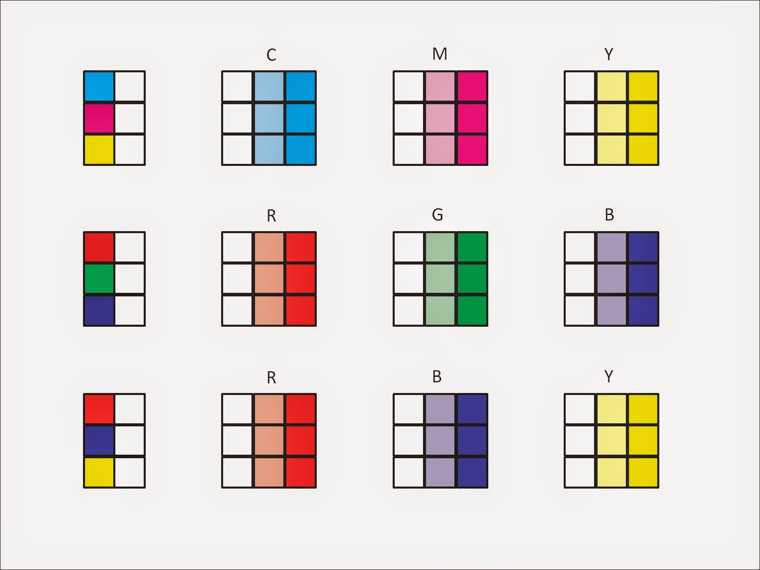
Explanation of the test images
The image below shows the layout of the first pass, the second pass, and an expected result. In the leftmost boxes, the simulated blue ink from the second pass is arranged to overprint the red ink from the first pass. The expected result, on the bottom, is various shades of purple. Similarly, the middle column of boxes show that yellow is arranged to overprint blue to arrive at the expected shades of green. And finally, in the rightmost column of boxes, we see that red is overprinting yellow to give us orange.

Design of the test of using artist's primaries for printing
The expected result above is hypothetical. What is the actual result? I did this test with my desktop printer (an Epson Stylus NX515). The first time through my printer, the red, blue, and yellow boxes were printed. On the second pass, These boxes with printed with blue, yellow, and red overneath.
I then used the scanner on this printer to change the printed sheet back into an image that I can share in my blog. Scanning it and displaying it on your screen introduces color error, but regardless of this, it's rather obvious that our expectation was way off for both of the mixtures that included blue. Red and yellow wasn't so bad.

Scan of the actual overprint result of RBY printing with bad mixes highlighted
In the box to the left, we see that adding red to the solid blue just makes it head toward black. Maybe it's a purple-black, but it's really not a pleasing purple. Similarly, in the middle box, mixing yellow with blue just pushes the blue closer to black. Note something interesting... both of the halftone overprints are sorta gray.
If we do the same experiment with cyan, magenta, and yellow inks, the overprints look much better. Cyan printed over magenta gives a nice purple - maybe a bit dark, but still unmistakably purple. Magenta printed over yellow gives a pleasing orange-red. Yellow over cyan gives a slightly dissatisfying green. I would have liked to see overprints of blue, red, and green, but at least the overprints are fairly decent colors.

Scan of the CMY overprint test
The test images
I have the two test images below. Unless I have messed something up, you should be able to double click on the images to get a full resolution version, and then save the files. If you can't get that to work cuz of some stupid mistake I made, drop me an email and I will send the images. (john@johnthemathguy.com)
Print one image (either one could go first). Then reload that page into your printer's paper tray. Take care to make sure the paper has the same orientation as it did the first time through. Getting the right orientation took me twelve tries, so you should be able to get it right after two or three. The sets of six boxes along the left side will all be filled in if you did this part correctly.
Since a full page was being printed anyway, I decided to test three sets of primaries. The top row of boxes is a test of the CMY primaries. The middle row tests the RGB primaries that are used in computer monitors and television sets. The bottom row is our now infamous test of the artist's primaries.
First pass

Second pass
Here is a scan of the full page that came out of my printer:

My results
So... why don't we print with red, blue, and yellow? Because cyan, magenta, and yellow work better.
WTF?
WTF?
If you had subscribed to the executive version of this blog, this would be where I make it all clear why there are different primaries for mixing light (as in a computer monitor or stage lighting), mixing ink or filters, and for mixing paint. But, alas, most of you will need to wait for another blog post to answer this question. Stay tuned for my expostulatings on RGB color theory!
No comments:
Post a Comment